The Seven Deadly Sins of Web Design
Published on 31st October 2021
Think of your website as a brick-and-mortar shop. You walk in…first impressions are everything.
Is it easy to find what you’re looking for? Is the shop visually appealing? Can you get help if needed?
If the answer is no to any of these questions, you’re more than likely to take your business elsewhere. The same applies for web design.
This Halloween, you don’t need to be concerned about ghosts or witches. What you need to be scared about is just how many potential customers you could be losing due to poor website design. So, without further ado, we give you the 7 deadly sins of web design that you should avoid at all costs…
1. A slow loading website

‘Slow and steady wins the race’ is certainly not the case for web design. 53% of mobile site visits are abandoned if pages take longer than 3 seconds to load. Just. Three. Seconds.
We are impatient beings with very high standards; even Google will penalise you if your page takes too long to load. There are many ways to improve your speed, but one crucial way is to compress your images by using .jpeg file formats.
Another helpful tip is to use an online tool like Optimizilla to keep file sizes as small as possible. It’s also best to avoid adding too many widgets as well because these can also slow things down.
Remember, speed is key - so don’t let this be the reason visitors don’t explore your carefully crafted content.
2. An unattractive, cluttered appearance

In web design, appearance is everything. As visual beings, users are likely to make a snap judgement of your website based on your images. So, make sure they are all high-quality, attractive, and professional images that truly reflect your brand. After all, beautiful websites attract valuable traffic and get people to interact with the content.
3. Unreadable text

You also need to ensure that your content is easy to consume. The majority of users will scan your content, picking out the most important words and phrases. So, direct them to the key points and features of your business. This can be achieved by crafting subheadings that sum up each section of information and using bullet points to reduce lengthy sections of text.
Also, take care to select your font size and line spacing carefully to further ensure the information can be easily read, making sure your colour scheme is also suitable.
4. Difficult to navigate
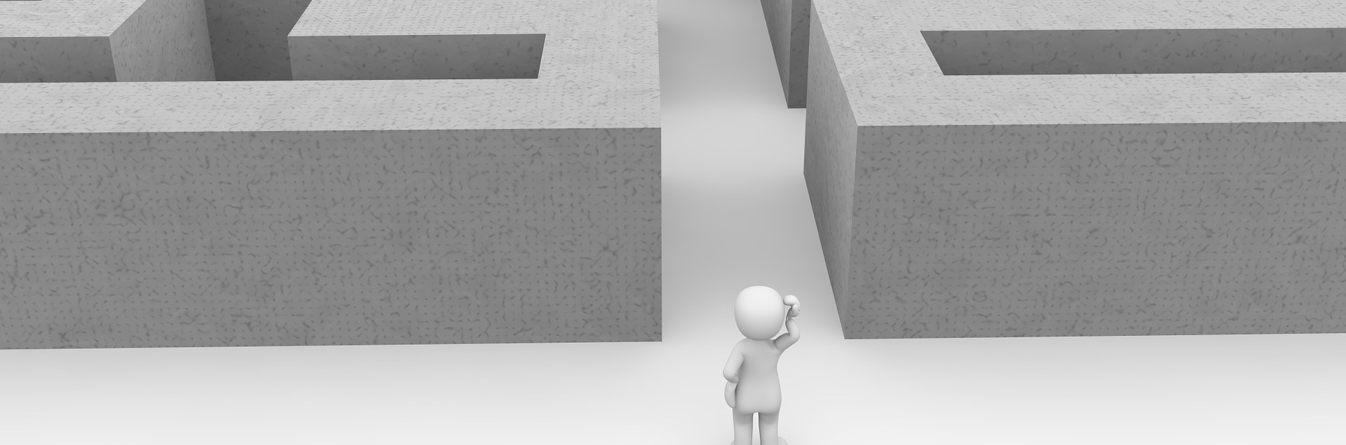
Essentially, your website needs to be well organised and follow an effective structure to ensure that it is easy to navigate, allowing users to discover the information they are looking for.
You need to make sure your website has been designed with users in mind - make sure it is consistent, ensuring users don’t lose their bearings or have to reorient themselves constantly. Also, ensure that your categories are divided clearly and accurately as misleading navigation text can confuse users to the point of site abandonment.
5. It is not mobile-friendly, nor responsive

More than half of digital traffic online now comes from mobile devices and through mobile apps. Not having a mobile-friendly website has dire consequences. Google will index your website’s mobile version first - so if your website is not mobile-friendly, it carries the risk of not being as easily found in Google searches. Your website must be readily available across a variety of different platforms to achieve satisfaction from users and increased conversions.
By allowing users to access your website through multiple devices, you will be able to meet the users wherever they are, the moment it suits them. A mobile friendly website will ensure your hard work and time spent writing effective copy, selecting the perfect images, and customising your website is not wasted for you will be able to reach a wide audience of potential customers.
6. Overuse of keywords

Keyword stuffing can kill your SEO. Whilst it can be tempting to take shortcuts in an attempt to make your website rank higher in the search results, it is a black-hat SEO tactic that is likely to do more harm than good.
Examples of this include unnecessarily repeating words and phrases, and adding words that are out of context or not relevant. This creates an awful experience for users, driving them away from your business.
7. No call to action or page to contact

Don’t let your users leave - give them a reason to stay longer or, signpost them where to go next. This could be a link to your social media, a way they can sign up to your newsletter, or a form to contact you through. Without a clear CTA, users are likely to be unsure of the next steps to take, prompting them to leave your site.
So, there you have it - the seven deadly sins of web design! If you’re looking for more advice on how to avoid these web design horror stories, why not get in touch with us today. We have a wealth of experience that enables us to design websites that really bring businesses to life, helping you to create a great first impression and encouraging more customers to get in touch with you. It'seeze Websites have been recognized as one of the top eCommerce Development Agencies in the United Kingdom by Design Rush.
Tagged as: web design
Share this post: