How to structure a successful homepage
Published on 25th April 2023
It's super important to have a successfully structured home page. When someone visits your website, the first impression they'll have of your business is through the homepage. This page serves as a preview of your offerings, and visitors will likely evaluate whether or not to become a customer based on what they see. They'll look for information about what you sell, why it's relevant to them, and how they can benefit from your products or services. So how can you structure all of this information in the best way?
What is the most effective way to present your business's offering on your home page?
In an ideal world, you just tell visitors what you offer and they will flock to your contact page or buy your product, but as a website design company, we know that there is much more to it than that. It’s all about leading the visitor to where you want them to go.
Although there isn’t a one size fits all approach, for most businesses the advice below should work well in improving the visitor’s experience on their site's homepage.
For the sake of simplicity, this post will cover two main areas; home page structure and content, and the best practice for scanning content, that’s backed up by extensive research.
Home page structure and what to include
There are countless approaches to designing and laying out content for your home page and this will vary depending on your business. A creative film agency may simply want to promote just its portfolio examples, and a holiday destination business may wish to promote a search facility first and foremost. But for many typical businesses, there is often a hierarchy that is tried and tested and this works in the following way:
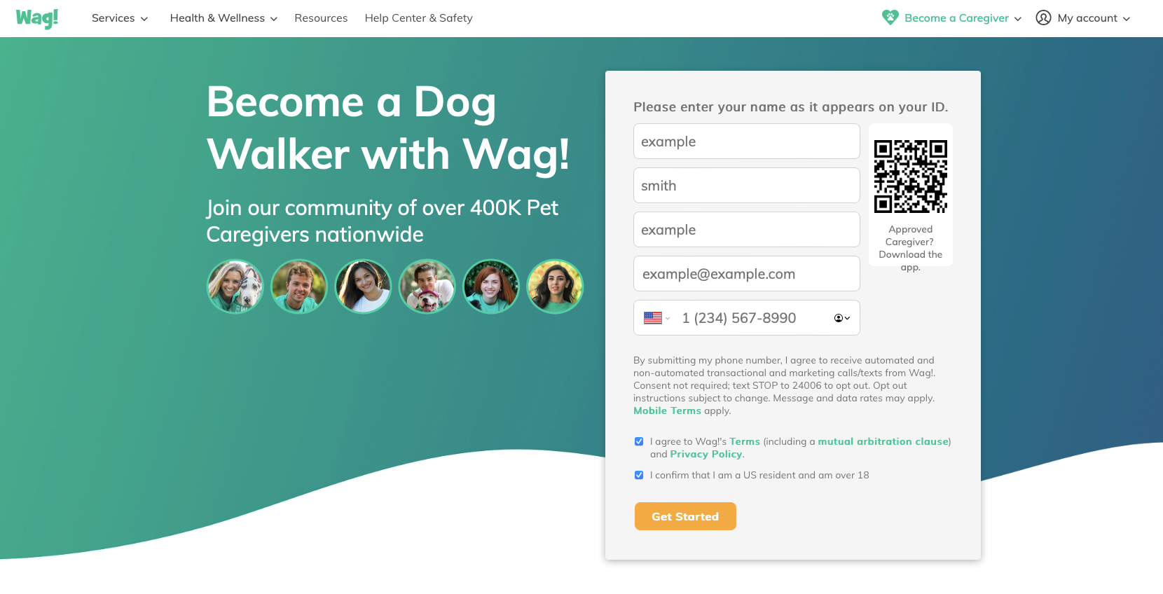
1. Impactful top section
We’ll presume your business has a good logo and navigation that is logical, and they’ll often be placed in the top section of the site in a horizontal format.
From a marketing perspective, you’ll need a compelling 1 sentence strap-line that is both engaging and solves a problem (tip: don’t say ‘Welcome to our website’ - it serves no real purpose!)
Now that you have an impactful tagline sorted you may want an image that represents the message that you're trying to convey. This can be done typographically with no imagery but for most a complementary image will add impact to your message.
Your tagline may be backed up with another sentence that explains a little bit more about what you offer, and a call to action can also be placed in this top section for visitors who might be familiar with your website or realise that you offer exactly what they need and want to get in touch. Your tagline might be so persuasive that’s all they need to take action but in reality, you’ll need to give them more.
Laying out your intro section
This can be laid out in a number of ways. It’s quite common to have strap line text left aligned or centred on a banner image. Here are some great examples of persuasive intro sections that you too can use as inspiration:
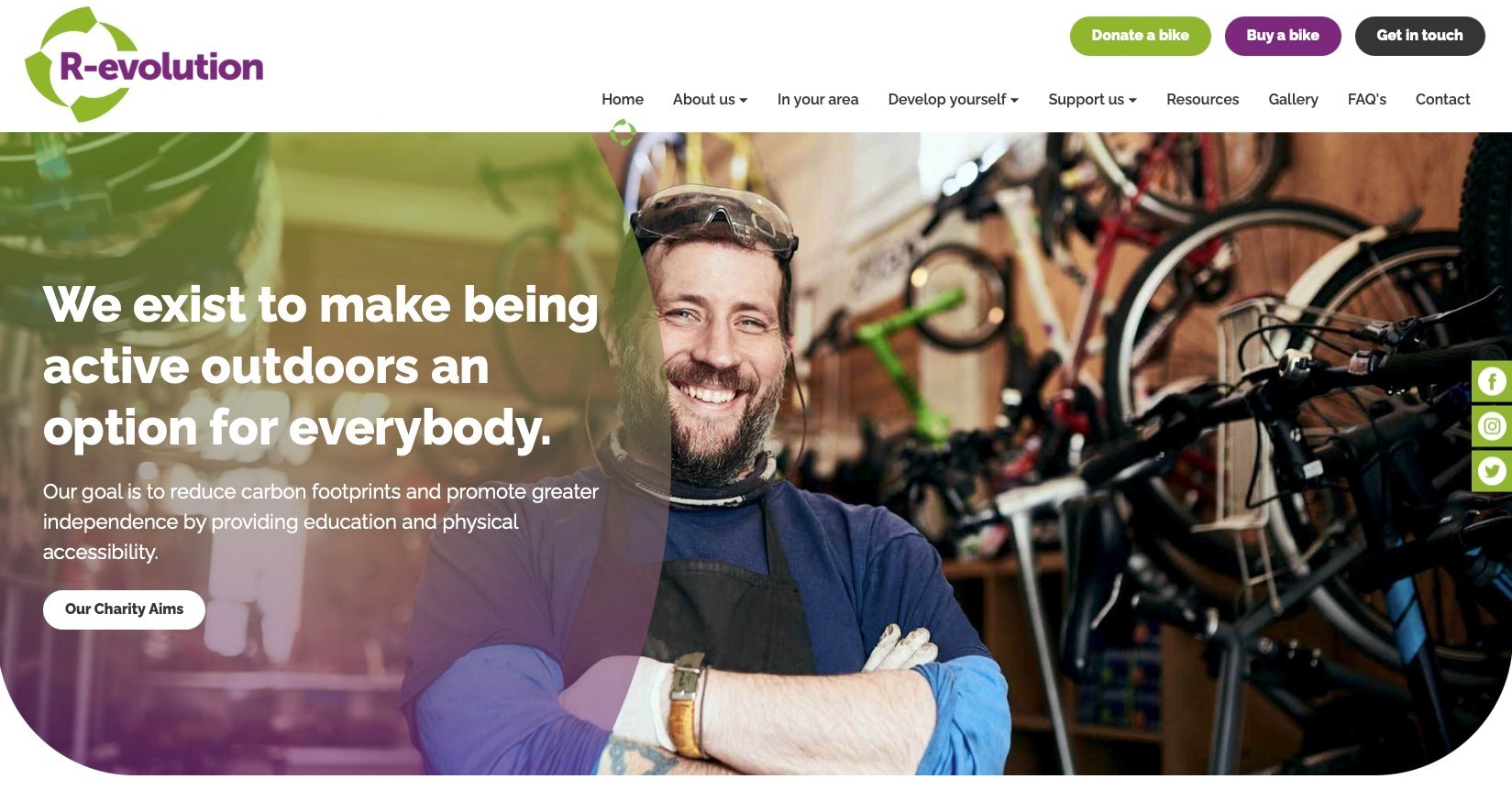
R-evolution state their business strategy prominently in its top section using a background image that complements this strategy.
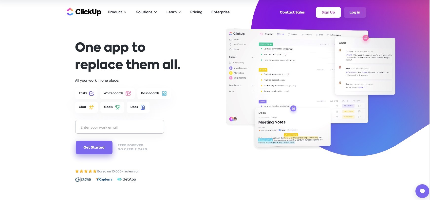
ClickUp emphasises the fact that their offering will make things simpler. This powerful heading is accompanied by a screenshot of key elements of their software.
2. Explain what you offer
Now that the visitor is engaged with your service or product, they may want to scroll past the top section and find out more.
This second section is where you promote your services or products and expand on what you can offer them to solve their problem. At this point, resist the temptation to go into great detail about your products or services, and keep it fairly top-level.
A typical scenario could be that you have several key services or products that you want to promote. Firstly, this could be presented in simple columns with imagery that reflects the offering. Avoid visual clutter and keep the messages for each service enticing and the imagery consistent.
Think about how this section flows
You want to entice the visitor in and funnel them through to the appropriate pages on your website. From the very start of your homepage, you should be considering the user flow but it’s even more critical that you get visitors to the right pages once you’ve introduced your product or service in a little more detail in this particular section.
Note: The term 'user flow’ shouldn’t be confused with the more commonly used term ‘user journey’. This user flow is on a more granular level, typically on a website or application whereas the user journey is a series of steps often across channels to accomplish a high-level goal with a product or business. As explained here by the Nelson Group.
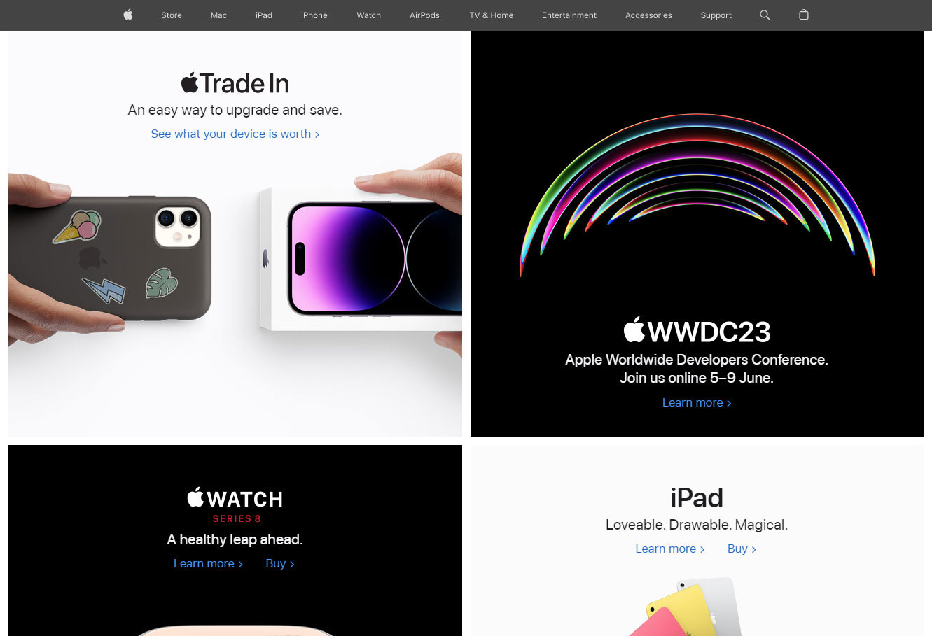
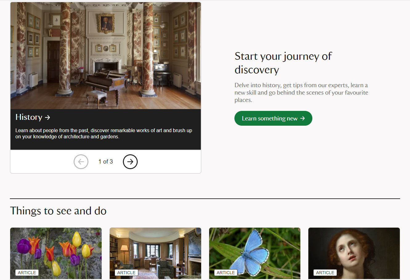
Apple often changes its home page key offerings. This example shows them promoting their trade-in services, conference announcements and new products that tie in with recent advertising campaigns. They tend to only promote two key products in the top section of the home page.
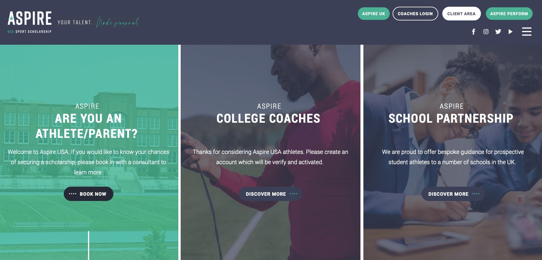
Aspire Sports Scholorship highlights three primary calls to action cleanly and concisely. The primary call to action on the left asks a question that could encourage engagement.
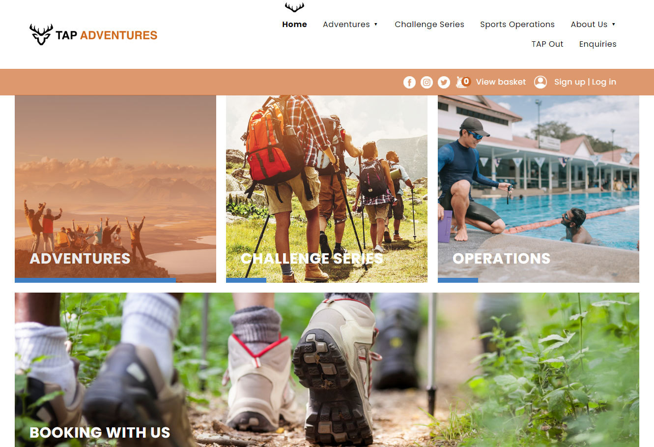
Tap Adventures clearly displays its services in a pictorial approach. It uses inspirational images with short headings making it feel intriguing and friendly to site visitors.
3. Call to action
This is where you can persuade your visitor to take action. Your message should be clear and obvious as to what the next steps are, so like the rest of your copy, it needs to be short and sweet.
A good practice is to give your visitor assurance and include social proof (testimonials) near your call to action. Again, don’t overload this section of the page with information and distract them. A single testimonial is often enough to give the visitor faith in your service or product.
When you do create your call to action it needs to stand out and have good contrast between any background colours on your page. In addition, you don’t want to bombard the visitor with too many calls to action, which can cause confusion. In some instances a single call to action at the base of your home page might be used to encourage engagement.

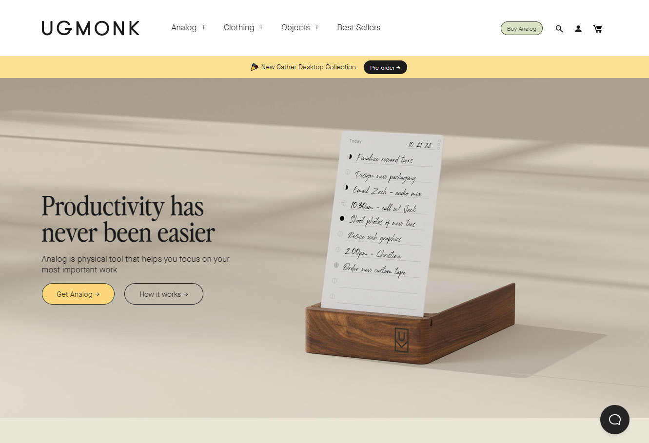
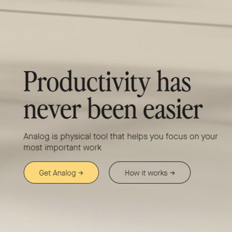
Ugmonk promotes his Analog tool to encourage organisation. He uses strong, high contrast call to actions urging visitors to purchase the product or find out more.
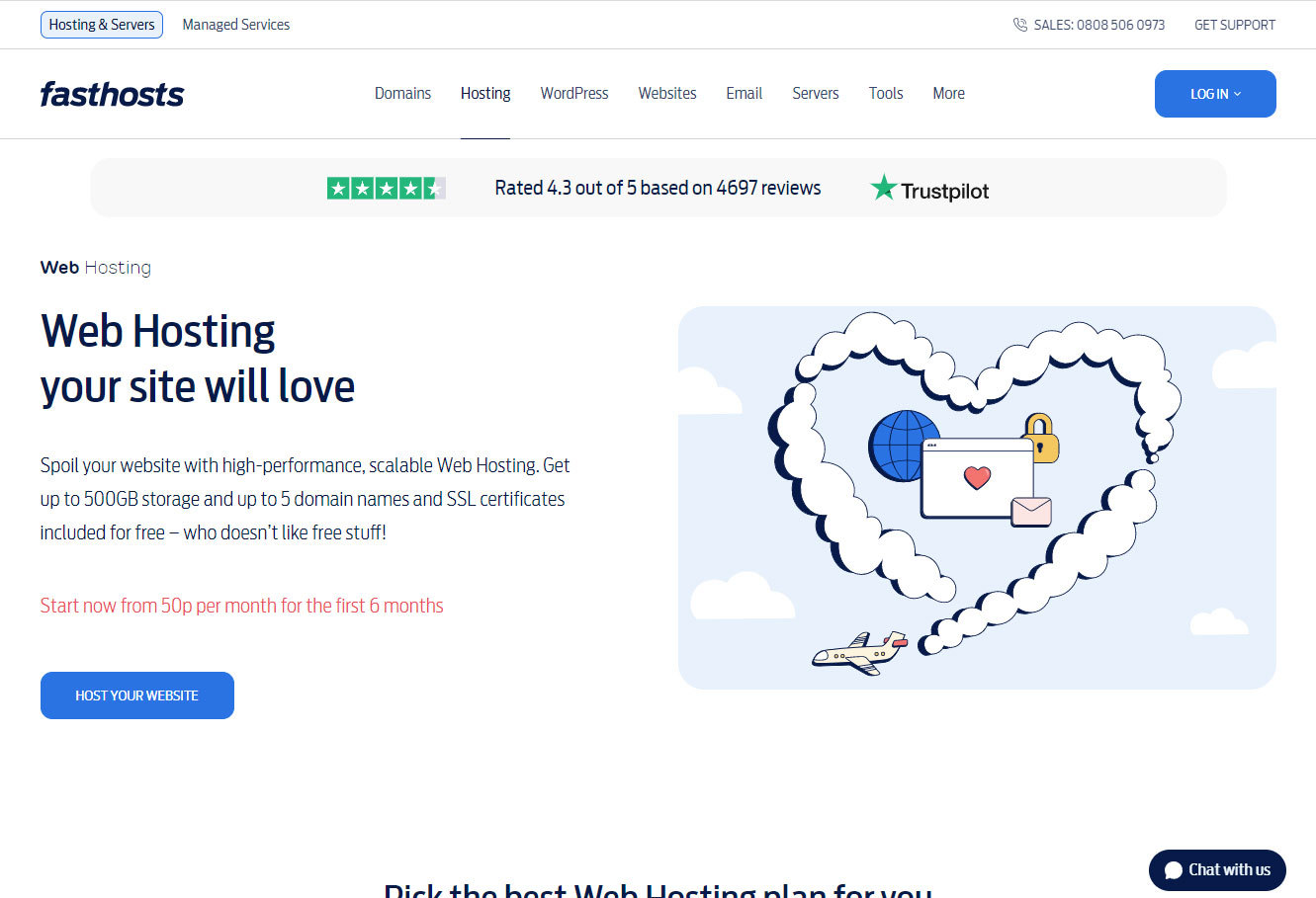
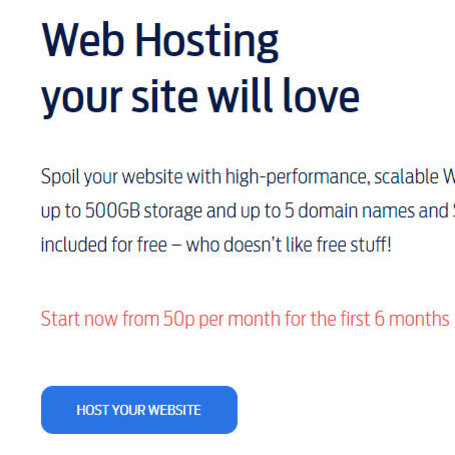
Fasthosts urges visitors to sign up for its affordable hosting services and quotes its competitive pricing above the call to action.
4. Add any other useful information
Now that you have included your impactful top section, details of your offering and the all-important call to action you have the option of including any other relevant information to add weight to your offering. This section should sit above the footer of your website and should show good colour contrast from the details within the footer section.
This may include critical details that support your product or service or details that establish some credibility for your business. First-time visitors may not be ready to commit to getting in touch and this area of the site could be critical in giving them that assurance to revisit your website to get in touch or make a purchase.
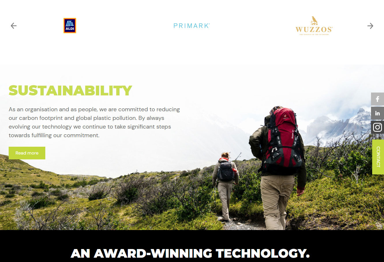
Microfresh promotes its commitment to sustainability and its ethos as a business to reduce its carbon footprint.
5. Make sure it works on mobile
Most businesses will know the importance of getting their websites working perfectly on mobile devices. Keeping content in a simple structure and not too wordy will help when working on smaller screen sizes. Presenting each of the sections mentioned above in digestible chunks will cut down the need for lengthy scrolling and frustration.
Although breakpoints can be added (breakpoints can omit content that appears on a desktop site from the mobile version), if you keep your home page content as streamlined as possible and designed with the appropriate text and image sizes it should work seamlessly on mobile devices.
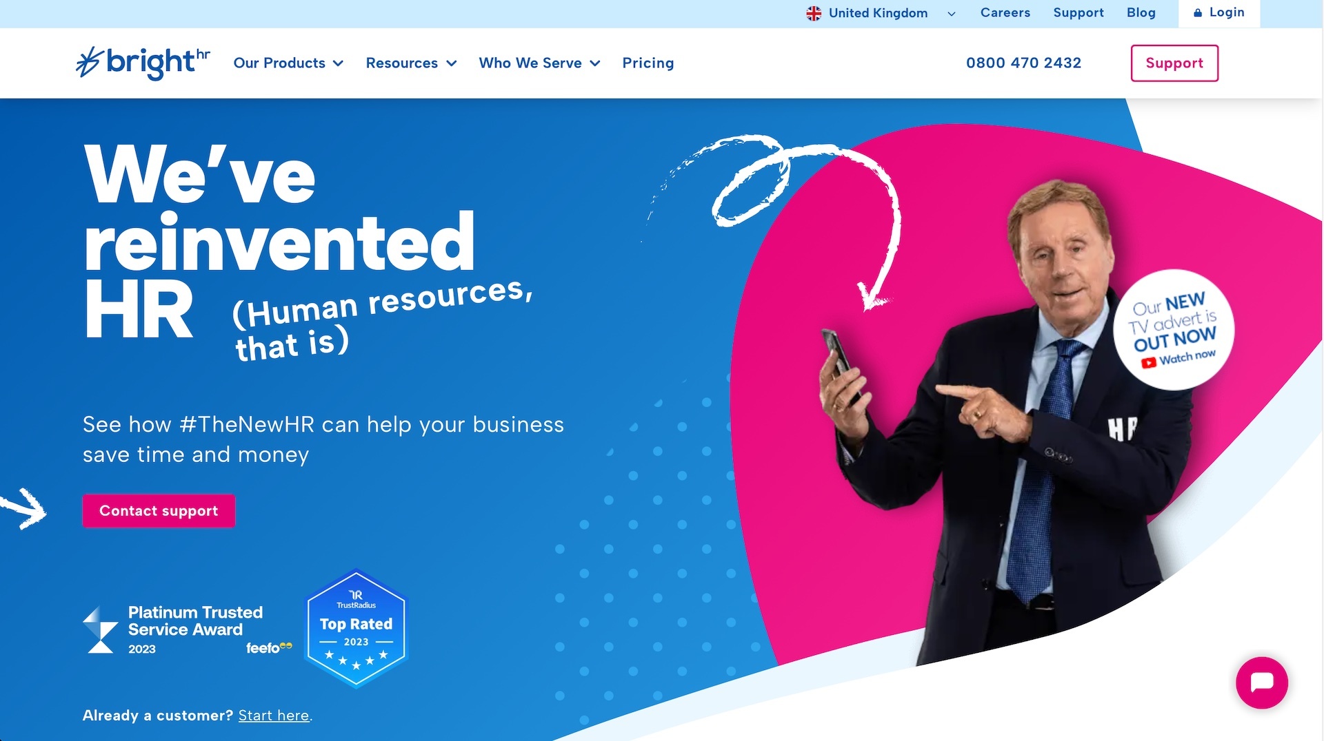
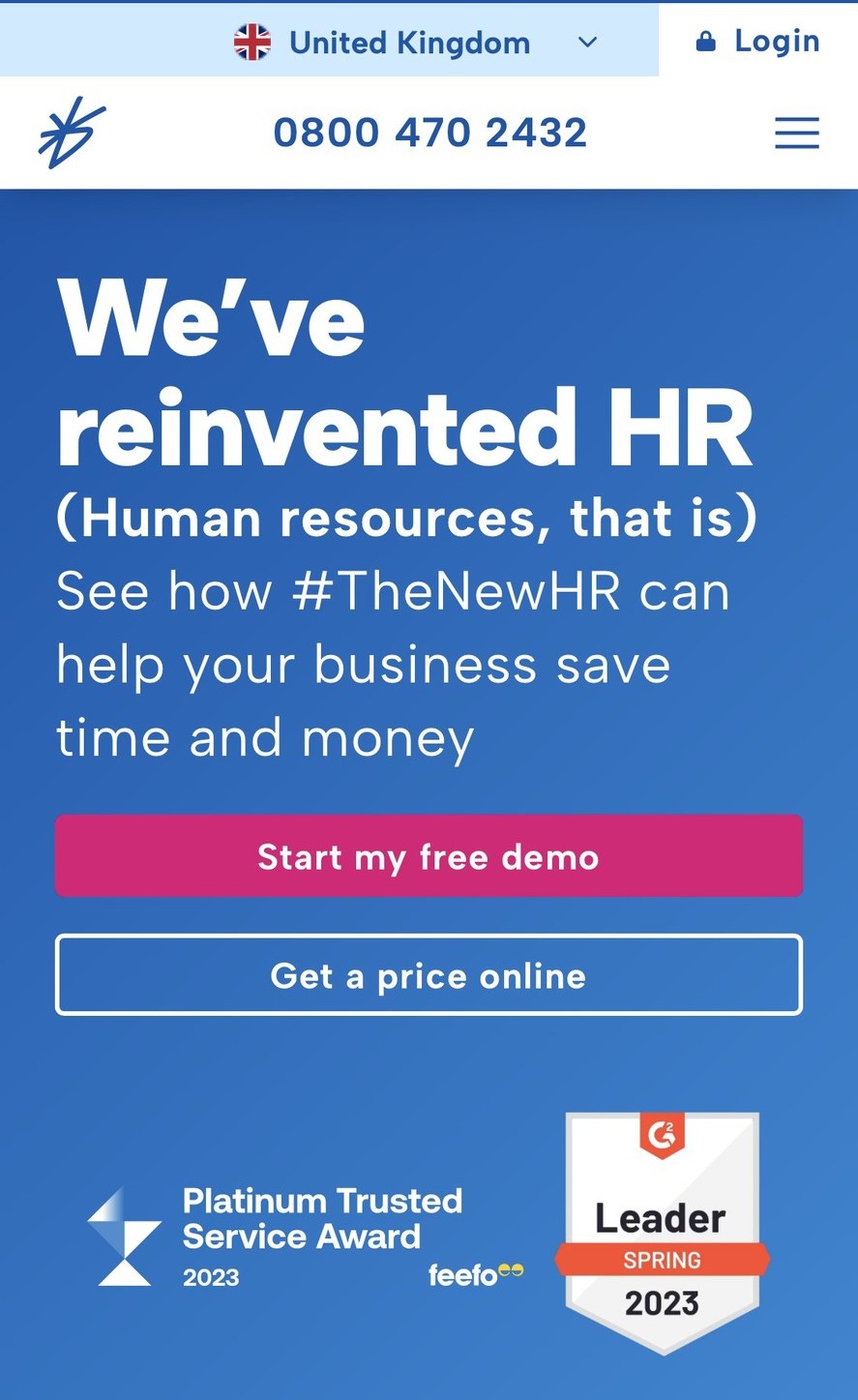
Brighthr website promotes the 'Re-inventing HR' campaign on both desktop and mobile. The mobile version is cut down graphically to place more impact on the headline and the call to action. They also use different calls to action from desktop to mobile, as it's possible that visitors on desktop and mobile need to be steered in different directions on their website journey.
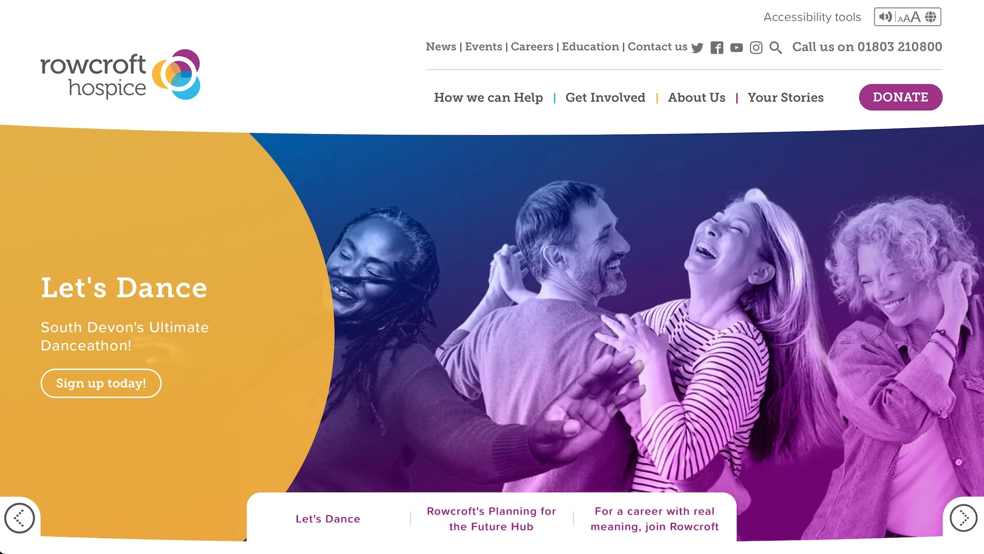
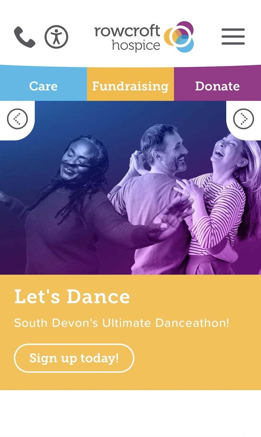
Rowcroft Hospice mobile and desktop versions both closely mirror each other from messages to photography. Whilst the mobile site promotes the 'Care, Fundraise and Donate' in a primary location near the top of the page the desktop site promotes this within its content areas further down the page.
Making your website easy to scan
We’ve touched on the type of content you should be including on your home page but what’s the best method to make your content very easy to scan and urge visitors to interact with?
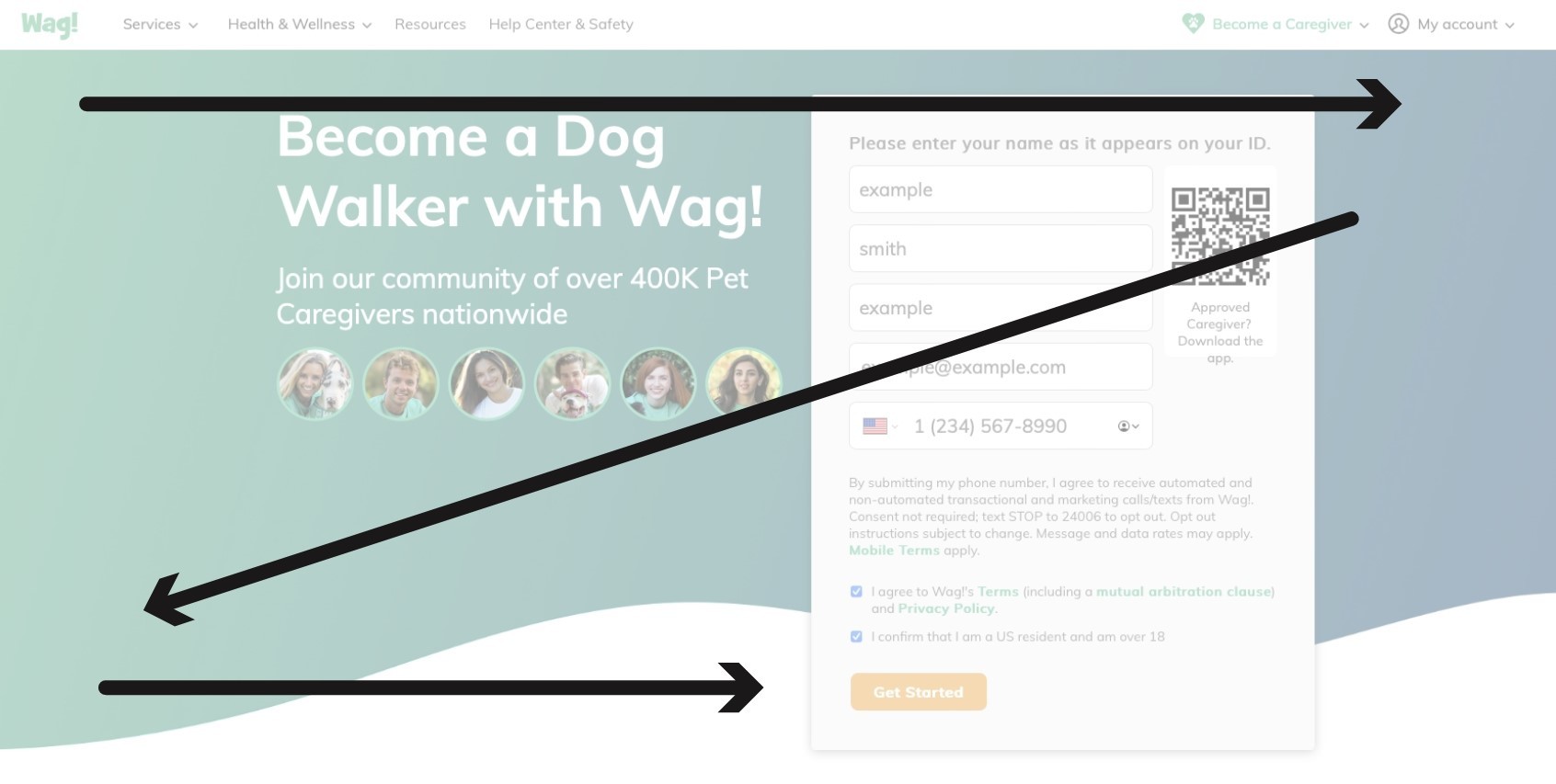
Designers have used two common methods in the past: The Z Pattern and the F Pattern.
The Z Pattern
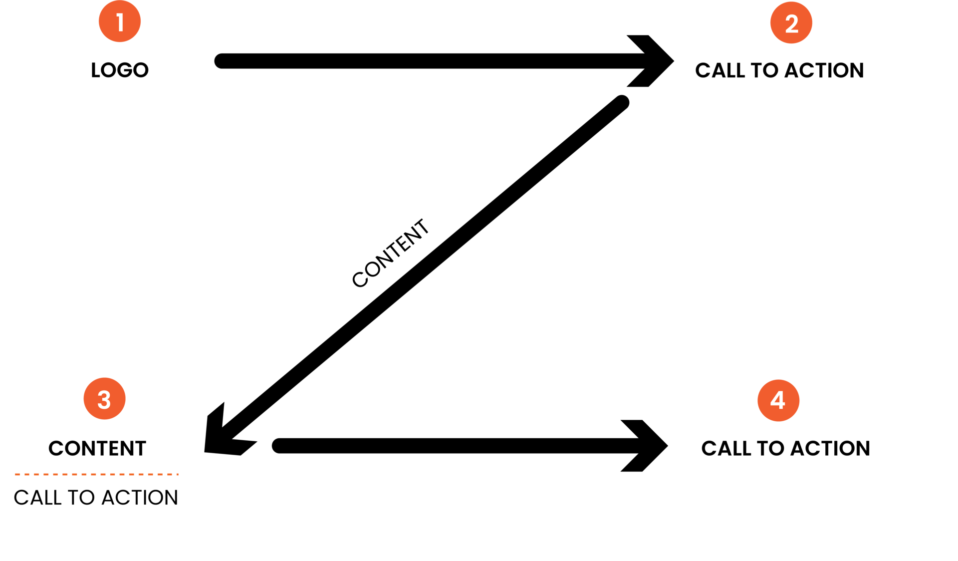
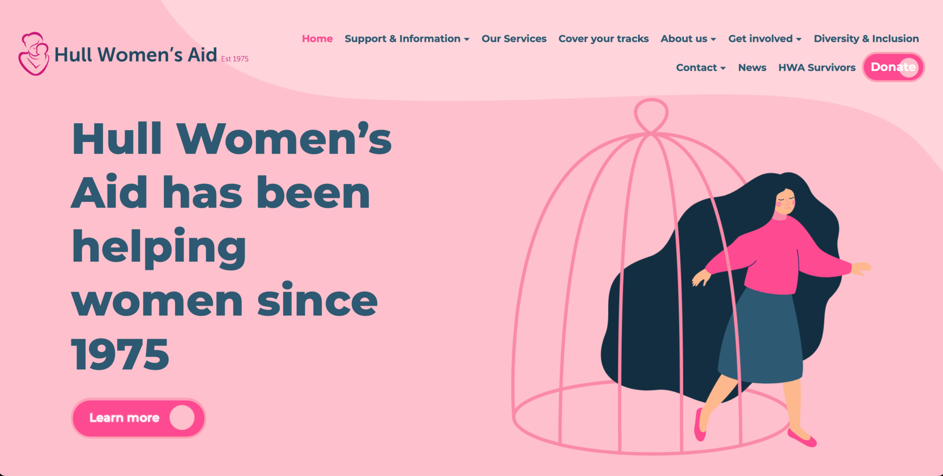
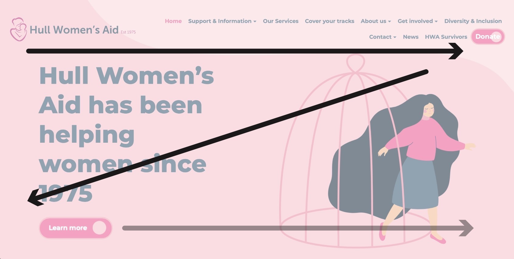
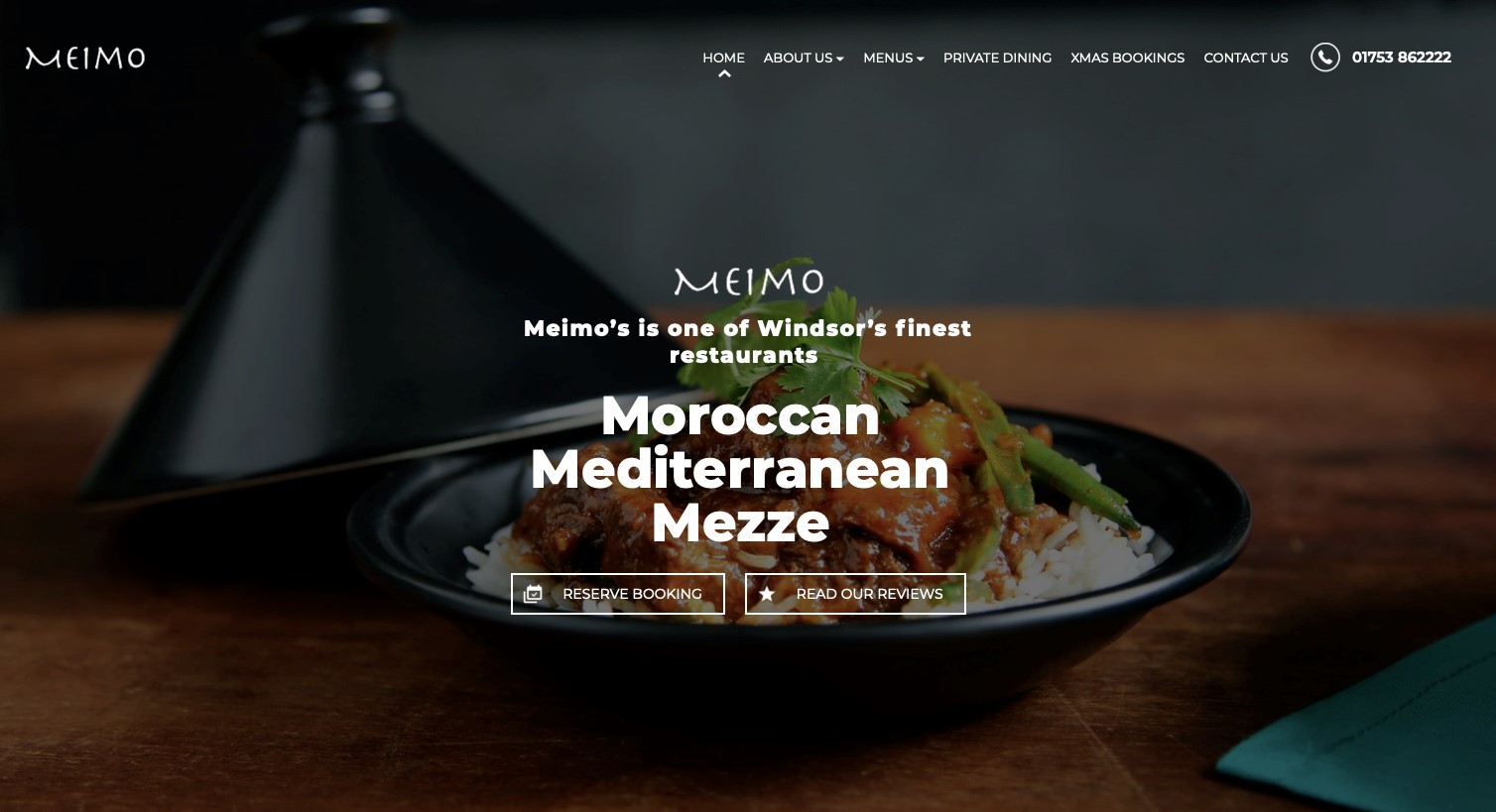
The Z pattern approach is a popular and effective method when guiding your visitors through your home page. This approach is pretty self-explanatory: place your information in a Z pattern from top left to bottom right with the final point being the all-important call to action.
The principle suggests that when scanning a typical website your eyes are drawn to the logo in the top left, then to a contact button or sign-up on the top right, an explanation of the services in the banner areas as you gaze diagonally and the call to action on the bottom section. The diagram below indicates the pattern:
The first suggestion in this article emphasises the importance of an impactful top section that often utilises this approach in a relatively small area. Here are some examples of intro areas using the z-pattern principle:
The F Pattern
Designers also use the F-pattern. The Nielsen Group first identified the F-pattern method of scanning in 2006 with the concept that visitors favoured scanning websites from left to right. Often picking out headings along the top of a page that piqued their interest in a horizontal movement, the visitors then tend to scan vertically from the top left side of the page before again reading from left to right on the page.
Although the F-pattern is most likely to be used on pages with heavy content such as blogs, it’s also a useful method on home pages with lots of content.
Whilst this isn’t a perfect ‘F’ it gives an indication of this pattern when scanning for content. See the diagram below:
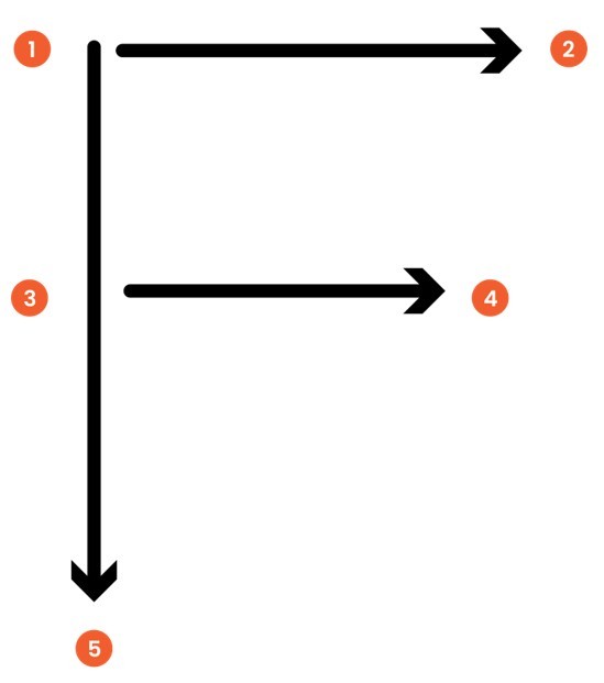
So, when creating or updating your home page, remember that the first lines of text or tagline on a page will attract more gazes than subsequent lines of text on the same page. So it’s important your intro section tagline is saying the right thing.
When explaining your product or service underneath your banner the first few words of text on the left of each line tend to receive more fixations than subsequent words on the same line. So, there is an argument to say that you place your more important messages on the left and make these words as explanatory and attractive as possible to help engagement.
‘Eye-tracking studies have indicated that most of what people see is in the top and left areas of the screen. The F-shaped layout mimics our natural pattern of reading in the West (left to right and top to bottom)’. Source: The Nielsen Group
The example sites below show the F Pattern approach being used:
Conclusion
As mentioned at the beginning of the article there are endless ways to display content on a home page and it's not a one size fits all approach. With that being said, visitors landing on your home page will digest information more easily in the ways advised in this article. So, when laying out content for your home page you need to look at all the content you have to display. Structure it into sections as advised and guide visitors to the call to action that will help them make a decision as quickly as possible.
At it’seeze, we create bespoke websites and make sure they work as efficiently for businesses. Designed by a team of experienced Designers and Coders ensuring we give all of our customers the best possible website with ongoing support.

About the author
Kevin Woods studied Graphic Design at Buckinghamshire New University, and is now the Managing Director at it'seeze, with over 25 years of experience within the fields of graphic design, web design and usability. Kevin works closely with our Design and Marketing teams and is always ready to take on the next creative challenge.
Tagged as: web design, website design
Share this post: