
How to make a stunning beauty website
Published on 27th June 2023
A beauty website isn’t just about the products. The website itself needs to look beautiful, too. It’s reported that 38% of customers will abandon websites if the content or layout is unattractive, and 75% of people will judge your credibility on your website alone, so spending time creating a stunning beauty website that is easy to navigate is worth it.
If you’re in the beauty business, whether it’s skincare, hair care, nail care or cosmetics, you know how important appearances are. So, you want your beauty website to not only look appealing but also stand out in the usability, engagement, and high converting aspects, too.
In that case, let’s talk about how to make a stunning beauty website you can be proud to show off to everyone.
Creating a stunning beauty website
When designing and building a beauty website, there are several factors to consider. Your website should connect with your audience and customers, be visually engaging, easy to use, generate sales, and deliver great content. So, let's take a closer look at each of these factors.
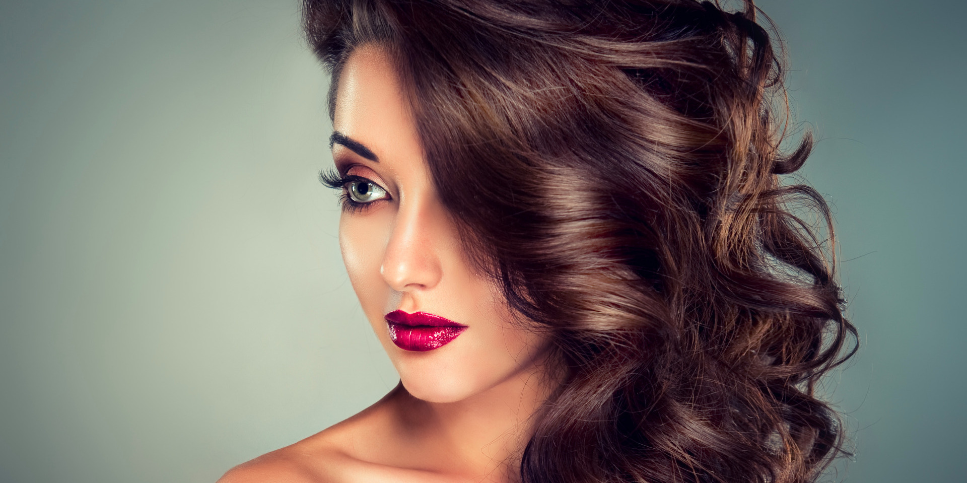
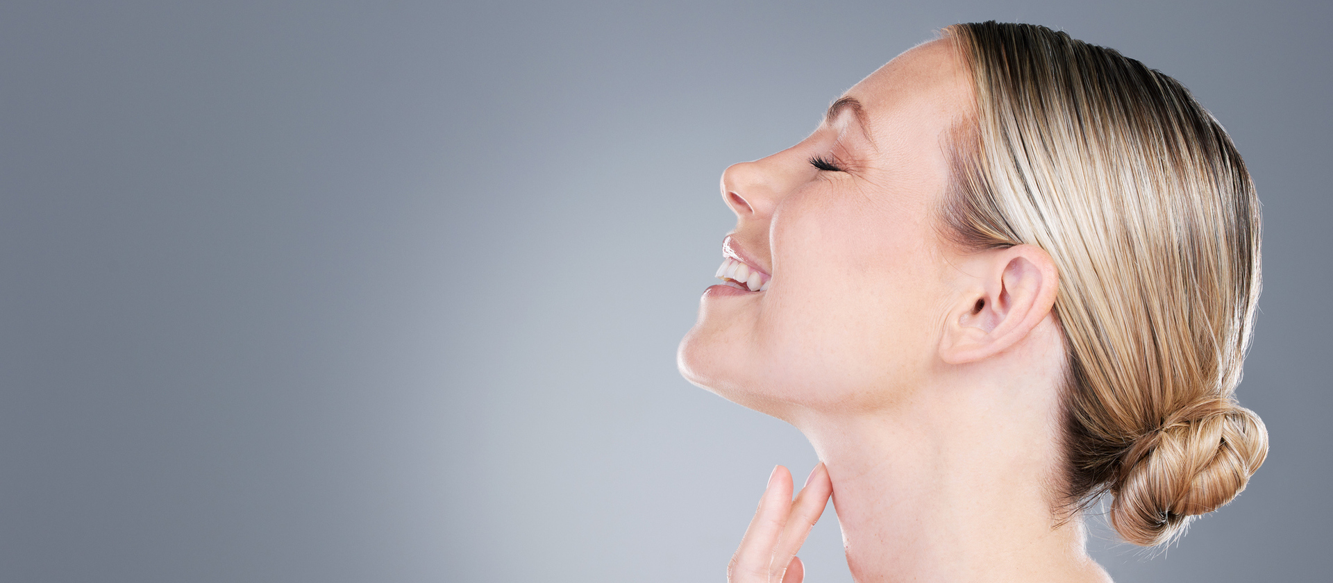
1. Visualisation
For any website, visuals are key to grabbing attention but with a beauty website, it’s even more important. But where those visuals are placed on the web page also has an impact. For example, if small in size and at the bottom of the page, they will have a low visual prominence. But bigger images at the top of the page will stand out better. The same principle applies to contrast and colours, text and video.
This is all based on the concept of visual hierarchy, which not only helps display your products clearly, but you are also able to direct the visitor to your website using visual elements. There are two main principles of visual hierarchy:
Weight and size. Your most important elements on the website, like your name and logo, should be bigger and bolder than other elements. This is because viewers naturally gravitate towards bigger, bolder, more colourful parts first.
Placement. By carefully using website layout, you can direct the visitor’s eyesight where you want. For example, call-to-action buttons placed in the middle of the screen will work better than those at the bottom.
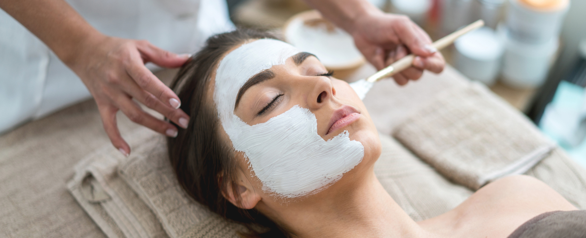
As well as your product images include photos that ‘back up’ any claims or highlight how good someone can look using your products. For example:
Create a gallery of the manicures, nail colours and pedicures you have done.
Include photos of makeovers or even videos of how to apply makeup and the end result.
If you have staff working with you, show them demonstrating their skills, like hair colouring or styling.
Encourage customers to not only share your product images and videos but invite them to post their own using your products.
2. Easy navigation
If it’s not easy to navigate through your beauty website, you will quickly lose your visitors. In fact, 37% of users say that poor navigation and design cause them to leave a website.
So, here are some tips to improve the user experience:
Include navigation aids, like search and indexing.
Link your logo/company name to the home page.
Make sure your menu is visible and easy to find, no matter what device it is being viewed on.
Don’t forget vertical navigation, especially if your website is long-scrolling, like a one-page website. For example, insert a Back to Top button.
Maximise your footer and include links to essential information, such as privacy policy and social network icons.
Think about how a visitor will view your website, which usually begins top left, moves right, then goes to the bottom left and moves right again.

3. Include social proof
There is a basic human instinct to ‘follow the leader’ and that’s what social proof allows people to do. Essentially, when others endorse your website or products, it provides people with validation that they can trust you. They are then more likely to buy from you and become a returning customer.
One of the easiest ways to do this is to add testimonials to your website and don’t be worried about adding too many. But there are other ways to add social proof to your website, including:
Influencer endorsements.
Customer product reviews – just five product reviews could lead to a 270% increase in conversions. Don’t forget video testimonials or reviews as these could have a greater impact.
Logos of companies that have mentioned your business.
Social media widgets that reveal how many people are following you.
Trust icons from association memberships, awards, beauty certificates, etc.
Don’t hide your testimonials and reviews on a dedicated page either. Include them on your beauty product pages and the home page.
4. Loading speed
If a web page takes more than 2.4 seconds to load, your visitor will start to lose patience. 4 to 5 seconds and 20% of visitors will have left. Page loading speed is crucial, not only in keeping visitors on your website but also for SEO ranking.
This applies to mobile devices as well. In fact, 85% of mobile users expect web pages to load just as fast, or faster, on their mobile device than on a desktop.
So, regularly check page loading speeds on all devices. In addition, make sure every link and button works efficiently. Consider the size of the images and other visual content, like videos, and perhaps make the mobile version smaller in size.
5. Go minimalistic and clutter-free
Visitors like white space, particularly on the home page. So, think about the design layout and keep it simple, clear, and easy to read and navigate. Here are some other tips to consider:
Keep the most important information above the fold, i.e. the area visitors see before they have to start scrolling down the page.
Make sure there is white space between the different elements on all web pages. There’s nothing wrong with having some blank spaces to add balance. Keep text in small, bite-sized chunks.
Include imagery, from photos and videos to vector art and icons.
Don’t forget your call to action button.
It’s often a good plan to stick to standard layouts and let everything else do the talking.
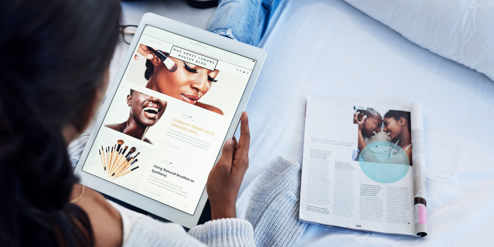
6. Don’t forget social media
One of the best ways to stay connected with customers is through social media, particularly for beauty brands. Integrating your social channels with your website is crucial to website engagement, brand exposure and reach, and for creating conversations.
Not only will it increase traffic to your website, but it will also increase traffic to your social channels. The most favoured channels are Instagram and YouTube for beauty brands where you can create ‘stories’, where you and customers can share content, and where you can encourage engagement and have conversations.
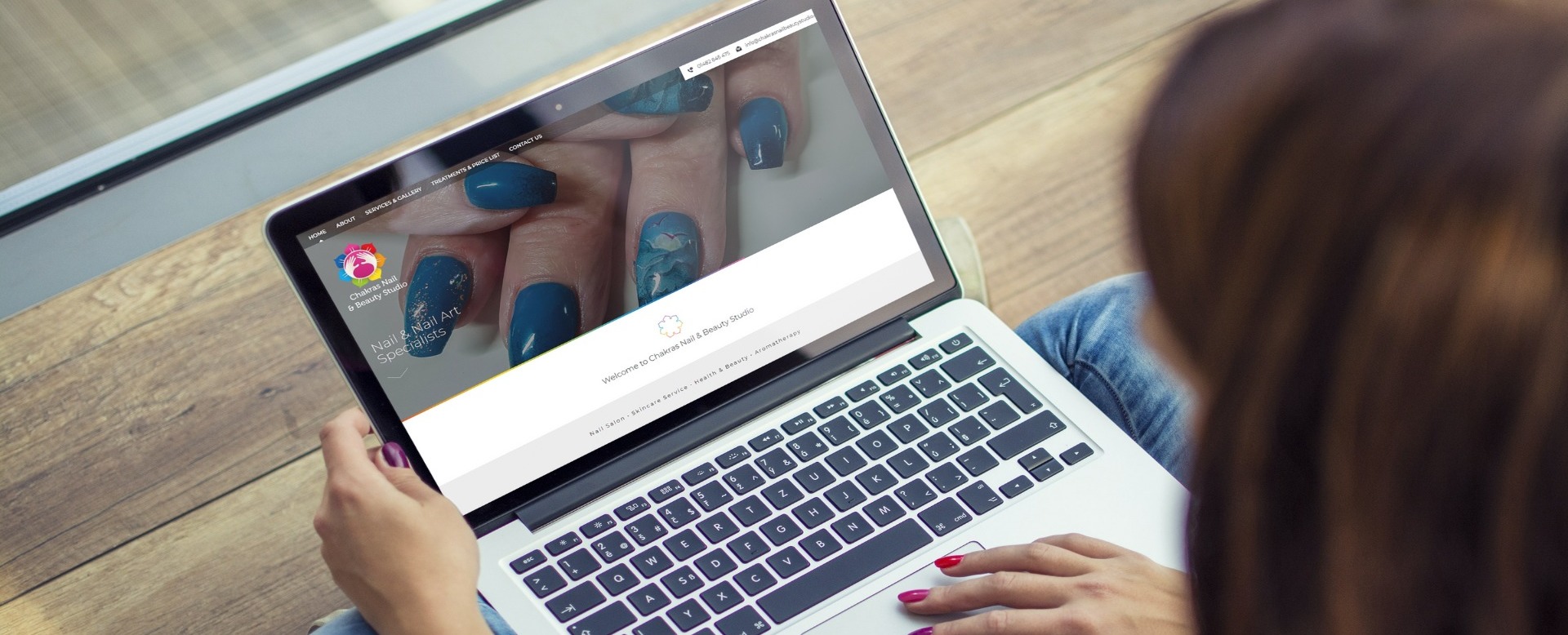
The power of your beauty website can make or break your brand. The way it is designed as well as its usability has to make an impact beautifully. Take a look at some of it'seeze's beauty websites:
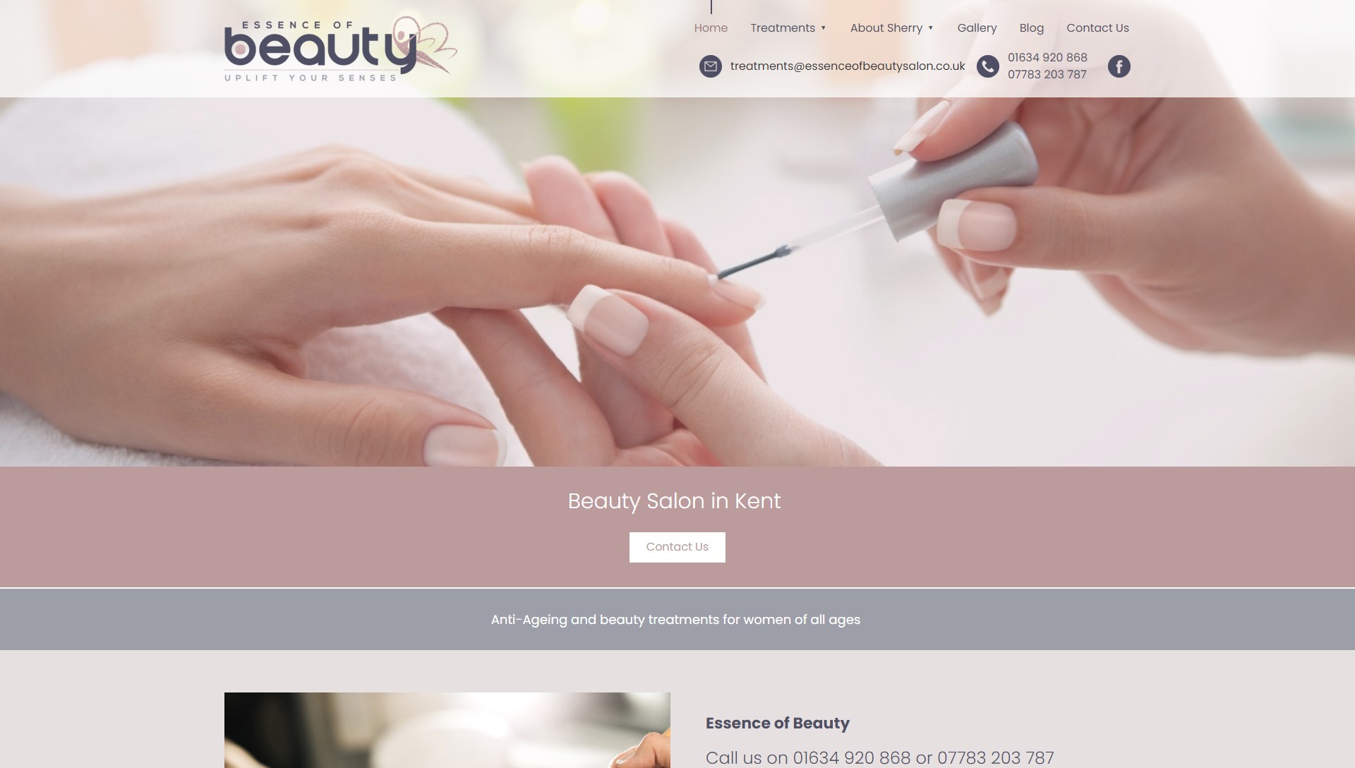
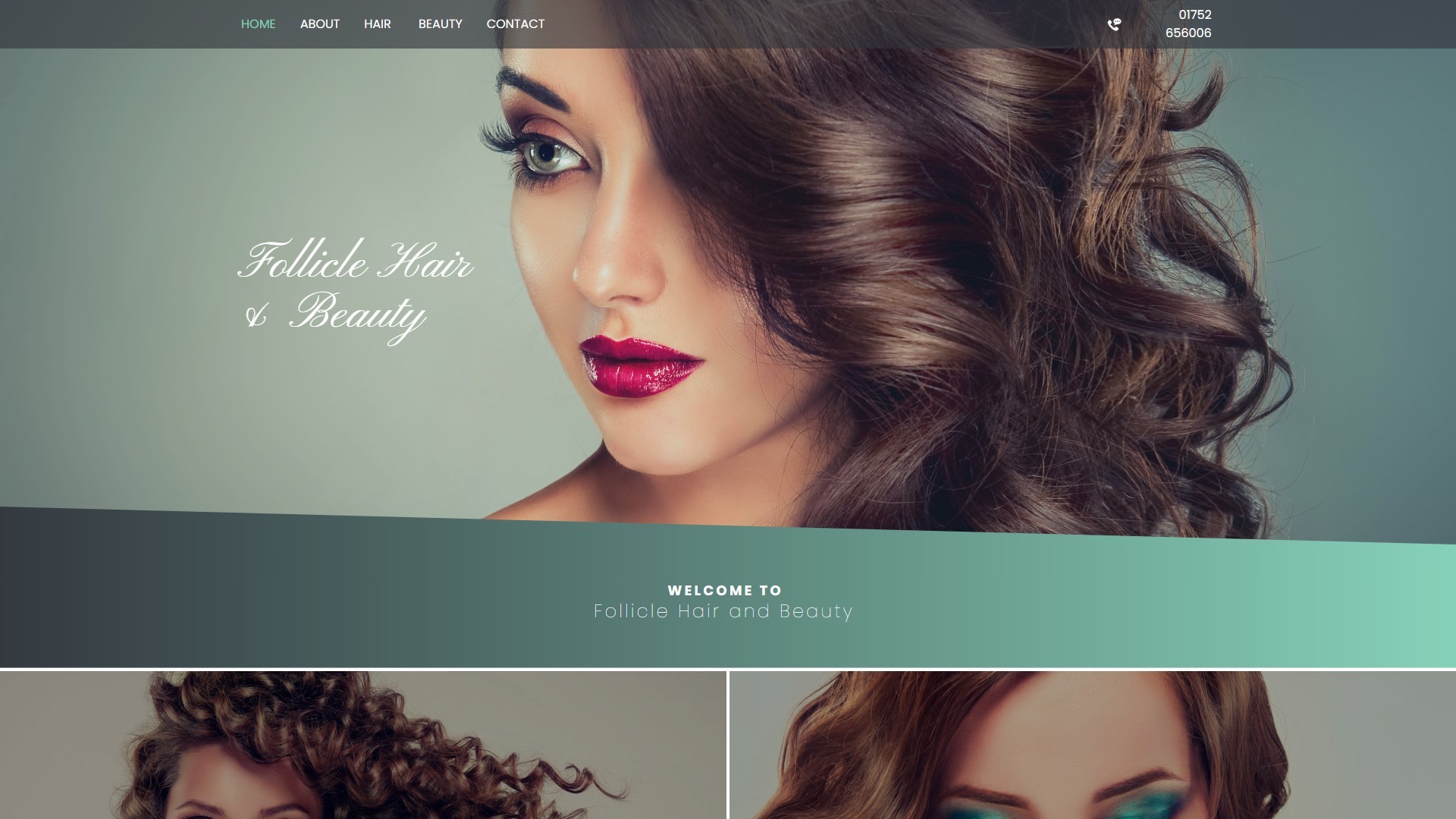
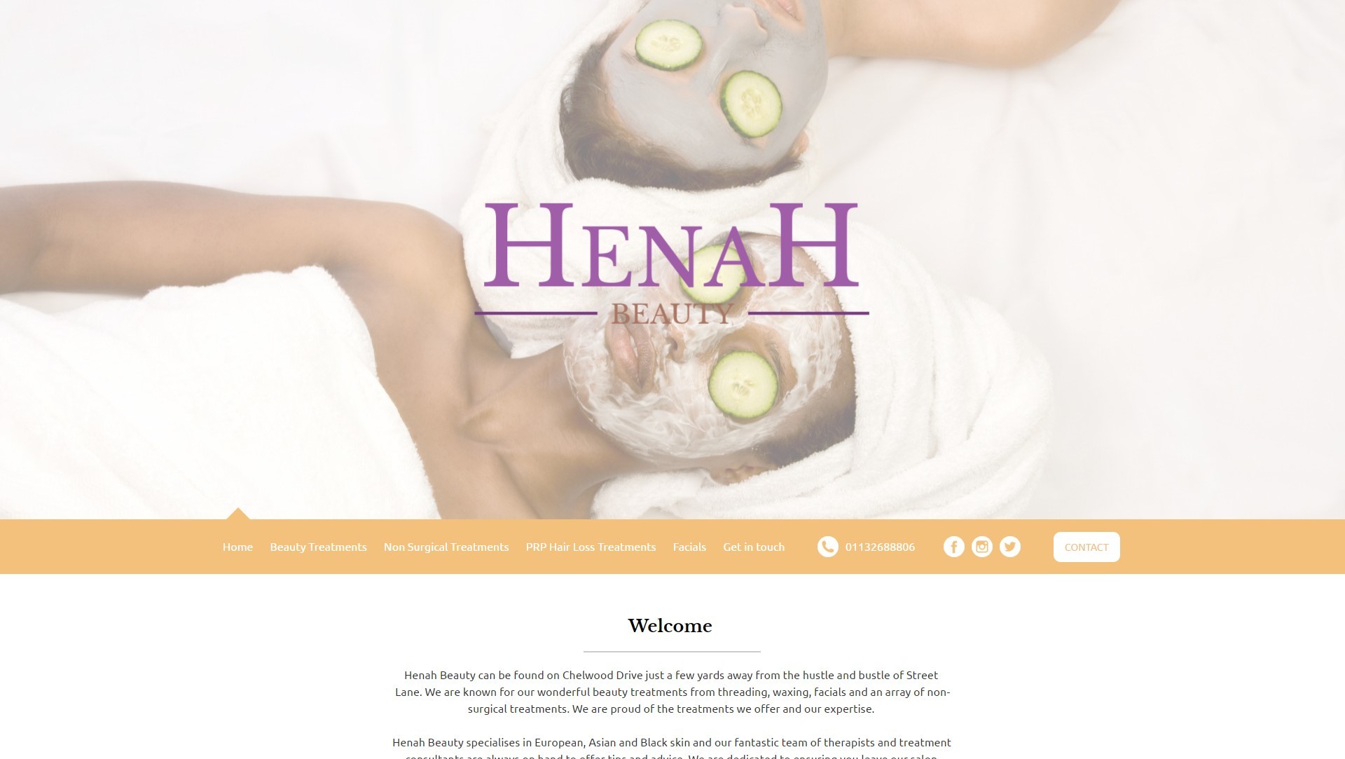
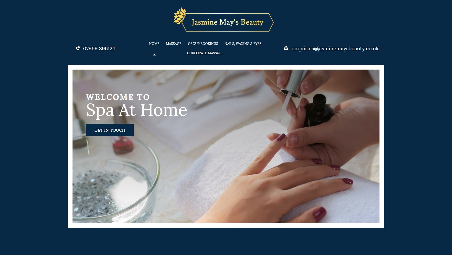
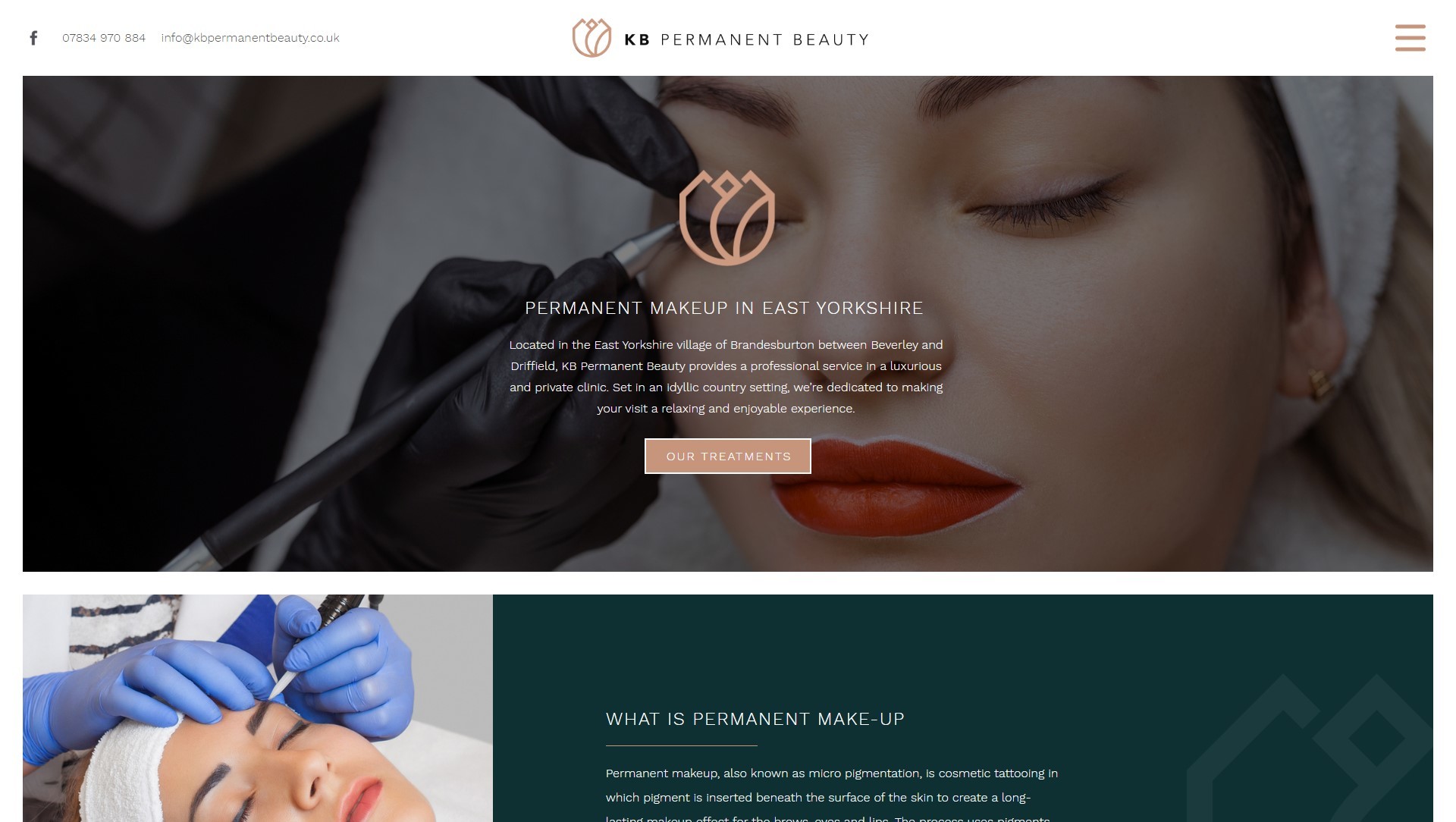
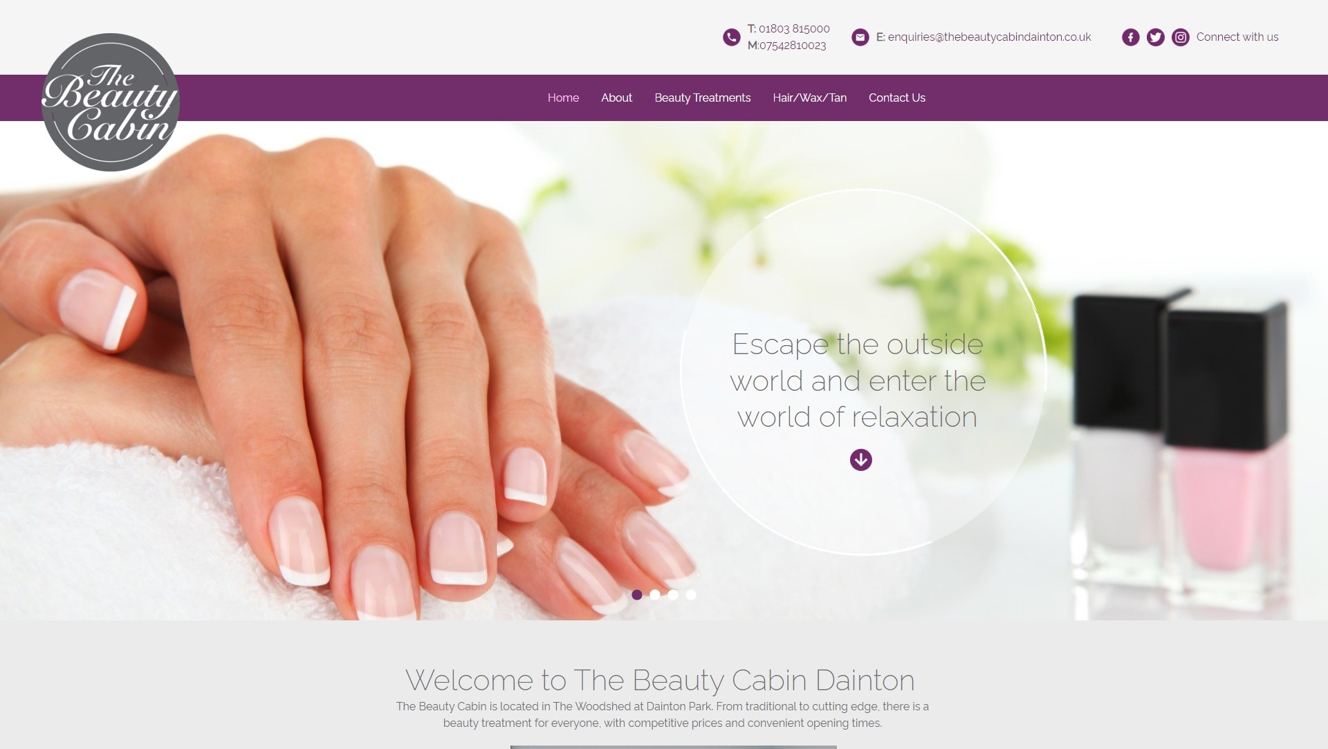
Our network of it’seeze website consultants throughout the UK and Ireland are on hand to help you build a stunning beauty website that packs a punch, in the right way. We help to ensure that it is fully optimised, effective, visually pleasing and able to generate enquiries as well as sales. Get in touch with us today to start your it’seeze journey.
Share this post: