The Call-To-Action, Explained: Everything You Need To Know About CTAs
Published on 29th September 2020
If you want to accomplish your marketing goals, you’re going to need a strong call-to-action to make this happen.
Small but mighty, the humble CTA is a key component of any marketing campaign, whether traditional or digital. It’s the magic ingredient that can turn your target audience into newsletter subscribers, brand advocates, and paying customers by providing them with clarity and encouragement.
Shockingly, up to 70% of small businesses are not taking advantage of this simple way to make their marketing more effective, with many lacking a clear call-to-action on the home page of their website.
If you’re unfamiliar with call-to-actions, or want to learn more about what makes a successful CTA, read on to discover how to make your website and other marketing channels work harder with the right words for the job.
Table of contents:
What is a call-to-action?
First things first, what actually is a CTA?
A call-to-action, or CTA, is a prompt that tells your audience to take a desired action.
On your website, a call-to-action makes it clear exactly what you want your visitors to do, and how to do it – for example ‘Buy now’, ‘Subscribe to our newsletter’, or ‘Leave a review’. These will typically take the form of a clickable button or hyperlink and help to direct interested users to the next step, increasing your chances of a conversion such as a product being bought or an enquiry being sent.
For this reason, effective call-to-actions should be persuasive, direct, obvious, and engaging.
What makes an effective call-to-action?
Your CTA serves two purposes – it should tell someone what you want them to do, and it should also give them the motivation to do it.
In order to convince people to take the desired action, your call-to-action needs to resonate with your target audience in just a few short words. According to one recent study, action words such as ‘Explore’, ‘Book’, ‘Talk’ and ‘Register’ are popular options.
Adding a sense of urgency and triggering a fear of missing out can be one particularly effective tactic for CTAs, as this encourages people to take action immediately instead of putting off what it is you want them to do. Limited time offers work particularly well.
Similarly, adding the word ‘today’ to your call-to-action has been shown to increase engagement, whilst adding ‘now’ to the end of the statement – alongside a countdown timer to increase the sense of urgency – can increase conversions by as much as 147%.
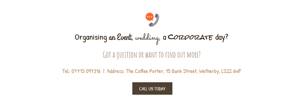
Adding 'today' to the end of the call-to-action here persuades potential customers to get in touch
It’s also a good idea to show the benefits of completing the action within your CTA, for example ‘Start your free trial today’, ‘Claim your unique discount’, or ‘Book your slot’. This reinforces the positives of taking action by highlighting the value your visitors will get from it – whether that means they gain access to free content, make a purchase at a special price, or reserve a spot at an event where spaces are limited, etc.
Another key part of emphasising the benefits of an action is pointing out the low risk attached – the less someone stands to lose from it, the more likely they are to do it. That’s why it can be helpful to focus on whether something is free or no obligation, with CTAs such as ‘Download your free guide’ or ‘Register now, cancel anytime’ making this clear for your audience. It should be said that clarity is another important factor to bear in mind when crafting your calls-to-action!
Something else to remember is to try and make call-to-actions more personal where possible. Avoid generic prompts and singular words where you can – i.e. ‘Download’, and instead try and tailor these to the audience who will be seeing them, bringing in a more personal and individual approach, such as ‘Download my free copy’ or ‘Show me how to grow my business’. HubSpot found that personalised CTAs actually performed 202% better than basic CTAs.

The personalised call-to-action on this website encourages people to click by using a first-person statement
As for how many words to use in your calls-to-action, research shows your CTA needs to be short, sweet, and to the point. A good CTA is one that is concise, and clearly directs people to the intended action. Depending on the content, this might mean you only need a one-word CTA, but in some instances a sentence might be necessary – there’s no hard and fast rule here.
When figuring out your CTAs for your website, we’d recommend testing a couple of options to see what gets the most engagement. Switch them out one at a time and keep track of which call-to-action leads to more conversions.
It can also be worth including a secondary CTA, just so you’re not losing any website visitors who perhaps aren’t ready to take action just yet. This means that rather than just including one button at the bottom of your content, you’d have two – one with your desired action, such as new customers signing up to your services, and another for those who haven’t made up their minds yet, such as learning more on your blog or browsing your other products.
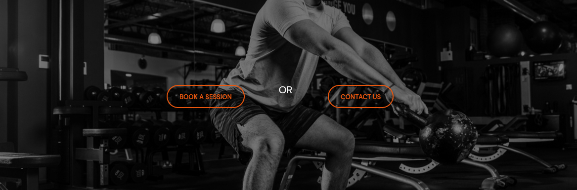
In this example, a secondary CTA gives visitors the option of making an enquiry if they're not ready to book
How to style your CTAs
The majority of your calls-to-action on your website are likely to be styled as buttons. The reason for this is that they’re instantly more engaging and your visitors know to look for them, whereas links within the text are more likely to be missed. In fact, styling your CTAs as buttons instead of plain text could increase your conversion rate by as much as 45%.
In order to grab your audience’s attention, a bright button that contrasts with the colour of your website page will typically work best. There should also be a good contrast between the button colour and the font colour, and because your CTA needs to be highly visible, the font size needs to be large enough to command attention when people are scrolling.
Whilst the colour of your button does very much depend on the colour scheme of your website, it’s worth noting that red buttons are reported to perform the best. Red is typically associated with urgency, so it can help to encourage visitors to take action.

The calls-to-action on this website are attention-grabbing and stand out from the rest of the colour scheme
Another thing to remember when styling your calls-to-action is the importance of whitespace. In design terms, this is simply the space that is deliberately left around an object. Leaving whitespace around your CTA buttons will ensure they stand out and don't get lost among the other elements on the page. In fact, reducing the clutter around your call-to-action has been reported to increase conversions by as much as 232%.
Where to put CTAs on your website
In deciding where a call-to-action button should go on your home page or landing page, the best thing you can do is let your content guide you.
There is a lot of discussion in the marketing world about the perfect place for a CTA, and the findings often differ wildly. Some studies have shown, for example, that a CTA placed above the fold (that’s the part of the page that website visitors see without needing to scroll) works best, whilst others maintain that your call-to-action should fall at the bottom of the page.
The reason for this is simple – your CTA requires your website visitors to do something, and they won’t do it without the proper motivation.
So, if you were to place a ‘Sign up now’ button right at the top of your website page without having given the person any information about your services or products, it’s unlikely they’d be inclined to sign up there and then.
Instead, your CTA buttons should align with your website visitor’s experience – have you given them enough information or motivation to take action? There are plenty of times when a call-to-action above the fold will make perfect sense – for example, if you’re asking visitors to ‘Find out more’ or have provided enough info for someone to make an informed decision.

A CTA asking visitors to browse the shop appears above the fold with accompanying text to inform their decision
However, if your page contains a lot of need-to-know information where the benefits of your offering are clearly presented, it makes more sense to include your CTA at the end when you’ve warmed them up and shown the value in completing that action. This also fits better with your audience’s natural reading flow, as many website visitors will read top to bottom, left to right.
One tactic you might want to try is placing multiple CTAs on your website pages. This way, you stand a chance of converting both website visitors who don’t want to scroll too far and those who’d rather read to the bottom. This might mean placing a CTA at the top and bottom of your page, or a CTA halfway down the page and at the end. In some cases, placing certain calls-to-action at both the top and bottom of a landing page has been shown to increase the conversion rate by around 300%.
As with the wording of your call-to-action, we’d recommend testing various options to see what works best for you. Try a couple of different placements and measure which one generates more clicks – you might find that people are missing your CTA because it doesn’t stand out enough or they’re not scrolling far enough, or that one positioned on the right of your banner works better than one on the left, for example.
Final thoughts
Whilst it might seem like there’s a lot that goes into it, once you’re into the swing of creating strong CTAs for your marketing campaigns, you’ll find that they really are a simple but effective way to make your website and other marketing channels work harder for you.
It’s essential that you do include calls-to-action within your marketing, as you need to compel your target market to take action and help you achieve your business goals.
Here are the key things to remember:
Motivate your audience with strong action words
Use limited time offers to create a sense of urgency
Highlight the benefits and the lack of obligation
Make sure your CTA button stands out
Test, test, test!
If you are looking for a website that will help your business grow, and CTAs are just the tip of the iceberg, we can help. We take the hassle out of web design, ensuring you get a professionally designed, effective, and secure website that really works hard for you. What’s more, we offer ongoing website support as standard, so if you ever have any questions about calls-to-action – or anything else! – you’ve got an expert team ready to help.
Want to find out more? Simply get in touch with your local it’seeze consultant for an informal discussion about your website needs. We can also offer a free audit of your existing website, which will provide you with simple, actionable ideas to improve its performance.
Share this post: