What Is Responsive Website Design?
Published on 18th October 2016
Have you heard the phrase ‘responsive website’ or ‘mobile-friendly website’? Do you wonder what a fully responsive website design means? These phrases are being used more and more every day.
Today in our blog, we are going to inform you of everything you need to know surrounding these phrases and the latest in website technology.
What is a fully responsive website?
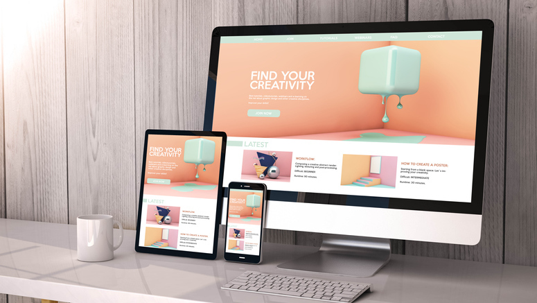
So firstly let's get this straight, a fully responsive website is a single website that adapts to any screen size. This means it's as easy to use on a mobile phone as it is on a desktop computer – no pinching or horizontal scrolling required.
Making sure your website is optimised for mobile and desktop is extremely important as mobile devices take up 63% of organic search results.
The website design instinctively adapts to the device it is being viewed on, so it looks just as great on a mobile, tablet, and desktop!
You can head over to our website to view website design portfolio to see examples of our own responsive websites.
Why does your business need a fully responsive website?
If your website is not mobile-friendly, then the 94.67 million smartphone users in the UK, will struggle to use your site which will lose you valuable business. If a user struggles to navigate around your site on their mobile, they are going to bounce off and go to one of your competitors within seconds.
60% of people won’t stay on your site if it is not mobile responsive.
67% of people are more likely to buy a product or use a service from a website that is mobile friendly.
Google takes a lot of factors into consideration when deciding what to rank on page 1. One of the factors is whether it's a fully responsive website or not, Google ranks mobile-friendly websites above non-mobile friendly websites in the search results – and this is why you’re at risk of missing out on mobile customers, as they are likely to be going to your competitors’ responsive websites instead.

Why is a responsive website better than a mobile website?
You may already have a separate mobile website – this is a second version of your company website that has been designed for mobile users only – and think this means you’ve got mobile-friendly web design covered.
However, with a fully responsive web design here to shake things up, that may not be the case – here’s why a responsive website that suits both mobile and desktop users is better for your business:
A responsive website works effectively no matter the device they are viewed on, allowing the user to access all website pages at all times – so your customers can enjoy the exact great website experience whether they’re viewing your site on a smartphone, laptop, or desktop computer.
Responsive websites load faster than mobile websites – saving valuable seconds and encouraging visitors to stay on your site. According to Google, 40% of people abandon a website that takes more than 3 seconds to load. The adage “time is money” is generally credited to Benjamin Franklin. In the present day, it can be updated to, “the more time it takes for an e-commerce site to load, the more money that business stands to lose.”
A single responsive website is more effective and less time consuming than a separate desktop and mobile website version:
• Everything will be in one place, you'll only have one website to manage and keep updated.
• You only have one site to optimise for search engines, so your SEO efforts won’t be diluted and you have the opportunity to appear high in the search results for both desktop and mobile users. It will also make it easier to track popular pages and trends as Google Analytics tells you what device traffic is coming through anyway.

How could a responsive website from it’seeze benefit your business?
At it’seeze, we create websites that are professionally designed, affordably priced - and fully responsive on all devices.
With our fully responsive web design services, your website will:
Look fantastic and perform just as fantastically on every device.
Prioritising the user experience by making it super quick for customers to find the information they’re looking for.
Seamlessly display videos, social media feeds, booking forms, and more.
Our unique responsive website editor is super easy to use to edit old pages and create new ones.

Why not get in touch with our friendly team today to find out more about how our responsive website design services could help you reach customers on all devices – from smartphones to desktop computers.
Share this post: