17 Web Design Trends To Watch Out For In 2017
Published on 8th December 2016
2017 is fast approaching, and with it comes the prospect for rapid change and development within the world of web design. A dynamic and constantly evolving industry, trends in web design tend to come and go at an impressive pace, with the latest innovations continually pushing the boundaries of what is possible, and helping to shape the future of the web.
As we look ahead to the new year, we’ve picked out what we believe are the most important web trends to watch out for in 2017.
Responsive:
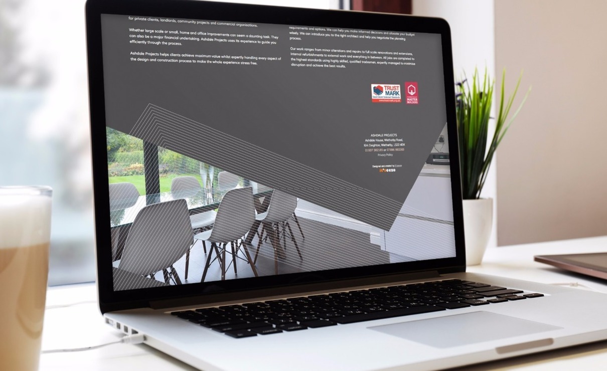
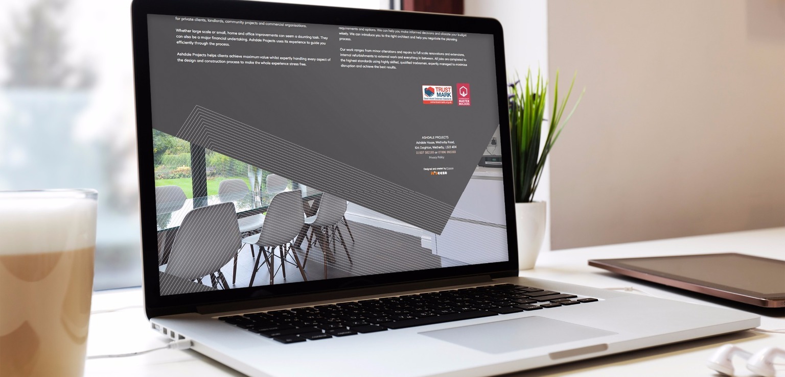
1. Increase in responsive design – Whilst responsive web design is nothing new, in 2017 we can expect to see sites that automatically adapt to every screen size really take off, with Google now ranking these websites higher in search results, causing responsive design to be implemented on a much wider scale.
2. Minimalism – With the focus on content that can adapt to different screen sizes, web design will go back to basics, with the minimalist approach emphasising quality over quantity through thoughtful, concise, and uncluttered design that allows businesses to highlight their most important information.
3. Reactive browsing – We won’t just see device-specific responsive design in 2017 – instead, websites will optimise content for individual users through age-responsive design – meaning they will automatically adapt based on the age of the user. This audience-specific approach will mean tailored content, colour schemes, font sizes, navigation and more.
4. Innovations in scrolling – With users now browsing on screens of all sizes, scrolling has become more creative. A trend that will continue in 2017, features such as parallax scrolling – where the background moves at a slower rate to the foreground, creating a 3D effect, will be implemented across responsive websites for easy navigation, increased engagement, and effective storytelling.
Responsive design
Minimalism
Visual:
5. Original photography – 2017 will see a rise in visual authenticity as brands move away from stock imagery as a way to promote their products and services. In an attempt to stand out, websites will instead feature high quality, bespoke photography, resulting in unique, creative, and visually diverse web content.
6. Asymmetrical design – An eye-catching technique that creates a truly distinctive look, asymmetric websites are set to trend next year, with the imbalanced nature of the layout helping to focus attention on key elements as designers break the grid through the inventive use of space, images, colour, and typography.
7. Animation – As businesses strive for originality in 2017, more and more animation will start to appear across the web. Taking a website from static to dynamic, subtle animations can be used to direct and engage users, making the overall experience far more interactive and entertaining.
8. Bold colour choices – This year brought with it a lot of experimentation in colour, and this is only set to increase in 2017. Brands will continue to embrace statement colour schemes, using vibrant hues, gradients, and accent colours to inject personality into their websites and make themselves stand out from the crowd.
9. Creative typography – Helping to produce instant visual interest, the dramatic use of typography is sure to be a strong focus of web design in 2017. Through differing extremes in sizing, custom fonts, intense colour choices and more, words will be able to take centre stage on the page next year.
10. Split screen layouts – A fantastic alternative to traditional web design, the split screen layout will continue to grow in popularity over the coming year, with this versatile style, which sees web content divided into two or more vertical columns, making for a striking viewing experience when executed correctly.
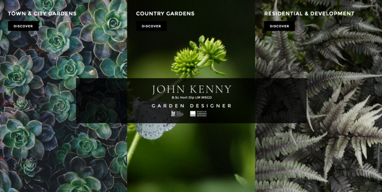
Split screen layouts
11. Video – Video is now a fundamental part of the online experience, and its dominance as a visual medium shows no signs of coming to an end as we head into the new year. In 2017, expect to see video content everywhere as brands use full-screen, immersive videos for storytelling, marketing, and customer engagement.
12. Personalised icons – With original visual content set to become the web currency of 2017, custom graphics are likely to feature far more prominently across the board. In particular, sites will make use of bespoke iconography for easy navigation, to break up large areas of text, and to emphasise calls-to-action, with the unique illustrations helping to set brands apart.
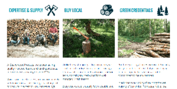
Personalised icons
User Experience:
13. Material design – Creating a modern aesthetic through a user-friendly, realistic looking interface, Google’s material design is becoming increasingly popular, and we can expect to see a lot more of it next year. Through subtle shadows, gradients, transitions, and colour, this design style gives the appearance of depth and dimension to websites.
14. Micro-interactions – All part of streamlining a user’s web experience, micro-interactions are small tasks completed on a website, such as liking a post, changing a setting, or choosing a password. Designed to be as intuitive and effortless as possible, micro-interactions are a great way to encourage users to engage with a website, especially on mobile devices.
15. Forms go full-screen – A direct result of responsive web design, in 2017 more and more sites are expected to take their sign up and feedback forms full-screen. More interactive, this new trend offers a less disruptive experience for visitors as it prevents a separate page from loading, whilst also encouraging users to complete the form.
16. Cards – Card layouts – where content is shown in individual boxes, as made popular by Pinterest, will be everywhere next year, with the versatile format allowing a greater amount of content to be displayed at once. Able to be filtered, organised, and customised according to a user’s preferences, cards offer both a more personal and functional approach to web design.
17. Image based navigation – In an effort to simplify the user experience, image based navigation menus will make a reappearance in the new year, with the key trends of custom visuals and improved functionality coming together to create an interesting but simple way for visitors to move around sites.
As 2016 comes to an end, there are many innovative new trends waiting in the wings to revolutionise web design and development in 2017, alongside many current improvements which will continue to grow and develop in the new year. As with all creative industries, there are countless trends in the works at any one time, but we believe those above are the ones to watch throughout 2017 and beyond.
Tagged as: web design
Share this post: